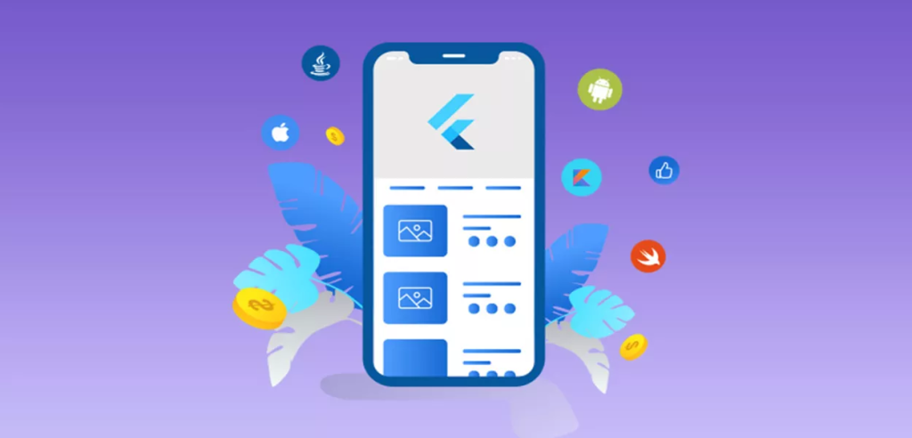
Flutter’s revolutionary approach to app development is deeply rooted in its widget-centric design philosophy, where every element on the screen is considered a widget. This concept is fundamental to understanding and effectively utilizing Flutter to build dynamic and visually appealing applications.
Overview of Flutter’s Widget-Centric Design Philosophy
In Flutter, widgets are the primary building blocks of the user interface, encapsulating everything from simple elements like text and buttons to complex layouts and interactive forms. This modular approach allows developers to construct the UI by combining and configuring various widgets to form a cohesive and functional app. Widgets in Flutter are not just passive elements; they define their structural aspects, styling, and behavior, making them incredibly versatile and powerful tools in the UI toolkit.
The hierarchical nature of widgets means that the UI is represented as a tree of widgets, where each widget nests within another, creating a structured and organized layout. This structure facilitates the easy manipulation of UI elements, as changes at any level of the widget tree can propagate and reflect in the interface seamlessly.
Importance of Understanding Widgets for Effective Flutter App Development
Mastering the use of widgets is crucial for any Flutter developer aiming to craft interactive and responsive applications. A deep understanding of different widget types, their properties, and how they interact within the UI allows developers to:
- Create Complex UIs: Knowledge of Flutter widgets enables the assembly of complex UI structures, catering to varied design requirements and user interactions.
- Manage State and Data Flow: Understanding stateful and context-aware widgets is key to managing the application’s state and ensuring a reactive and efficient data flow within the app.
- Optimize Performance: Proficiency with widgets also means being able to optimize the UI for performance, ensuring smooth and responsive applications that provide a positive user experience.
- Enhance Customizability: With a solid grasp of widget fundamentals, developers can customize and extend existing widgets or create entirely new ones, offering tailored solutions that fit specific app needs.
Understanding Basic Widget Types
Flutter’s UI building blocks, widgets, come in various forms, each serving distinct purposes in app development. Understanding these basic widget types—stateless, stateful, and inherited—is fundamental to crafting responsive and dynamic applications.
Stateless Widgets
- Structure: Stateless widgets are immutable, meaning their properties can’t change once the widget is created. They are ideal for UI elements that don’t require internal state management or depend on external data to render.
- Usage: Used for displaying static content like text, icons, and images, or for composing other widgets that collectively constitute part of the UI without directly managing state.
- Examples:
class MyStatelessWidget extends StatelessWidget {
  @override
  Widget build(BuildContext context) {
    return Text('Hello, world!');
  }
}
Stateful Widgets
- How They Differ from Stateless Widgets: Stateful widgets can maintain state that might change during the lifetime of the widget. They are dynamic and can respond to user input or other external events.
- Managing State: State in these widgets is persistent and encapsulated within a
Stateobject. The framework manages the lifecycle of this state, creating and disposing of it as needed. - Usage Scenarios: Ideal for interactive elements like forms, animations, or any part of the UI that changes dynamically in response to user interaction or internal events.
- Examples:
class MyStatefulWidget extends StatefulWidget {
  @override
  _MyStatefulWidgetState createState() => _MyStatefulWidgetState();
}

class _MyStatefulWidgetState extends State<MyStatefulWidget> {
  String _text = 'Hello, world!';

  void _updateText() {
    setState(() {
      _text = 'Hello, Flutter!';
    });
  }

  @override
  Widget build(BuildContext context) {
    return Column(
      children: <Widget>[
        Text(_text),
        RaisedButton(
          onPressed: _updateText,
          child: Text('Update Text'),
        ),
      ],
    );
  }
}
Inherited Widgets and Context
- Managing Data Flow and Widget Hierarchy: Inherited widgets are a way to efficiently propagate information down the widget tree, allowing nested widgets to access shared data or state.
- Usage: Commonly used for implementing theming, localization, or sharing data and state across multiple parts of the app without passing them explicitly through constructors.
- Examples:
class MyInheritedWidget extends InheritedWidget {
  final String data;

  MyInheritedWidget({Key key, @required this.data, @required Widget child})
      : super(key: key, child: child);

  static MyInheritedWidget of(BuildContext context) {
    return context.dependOnInheritedWidgetOfExactType<MyInheritedWidget>();
  }

  @override
  bool updateShouldNotify(MyInheritedWidget oldWidget) {
    return data != oldWidget.data;
  }
}
Understanding these basic widget types in Flutter provides a solid foundation for building complex and interactive user interfaces, enabling developers to leverage the full potential of Flutter’s widget-centric design for creating versatile and dynamic applications.
Layout and Container Widgets
In Flutter, creating an effective user interface heavily relies on understanding the layout and container widgets, as they are crucial for structuring the visual and functional elements of an app.
Layout Widgets
Layout widgets are used to structure other widgets within the UI, defining how they are organized and displayed on the screen.
Row:
- The
Rowwidget arranges its children horizontally in a linear fashion.Configuration options include setting the horizontal alignment (mainAxisAlignment), vertical alignment (crossAxisAlignment), and how children should fill the available space (mainAxisSize).
Row(
  mainAxisAlignment: MainAxisAlignment.center,
  children: <Widget>[
    Text('Item 1'),
    Text('Item 2'),
    Text('Item 3'),
  ],
);
Column:
- Similar to
Row, but aligns widgets vertically.Useful for creating vertical layouts and can be configured similarly toRowwith vertical and horizontal alignment properties.
Column(
  crossAxisAlignment: CrossAxisAlignment.start,
  children: <Widget>[
    Text('Item 1'),
    Text('Item 2'),
    Text('Item 3'),
  ],
);
Stack:
- Layers its children on top of each other, allowing for overlapping widgets.Widgets can be positioned using the
Positionedwidget or by setting thealignmentproperty to control how children are stacked.
Stack(
  alignment: Alignment.center,
  children: <Widget>[
    Container(width: 100, height: 100, color: Colors.red),
    Text('On top'),
  ],
);
Container Widgets
Container widgets provide styling and layout properties to their child widgets, influencing the appearance and arrangement of the UI components.
Container:
- A versatile widget that combines common painting, positioning, and sizing widgets.Can be used to apply padding, margins, borders, background color, or constraints to its child widget.
Container(
  padding: EdgeInsets.all(8.0),
  color: Colors.blue,
  child: Text('Inside Container'),
);
Padding:
- Applies padding to its child, creating space around the enclosed widget.Useful for spacing out elements in the UI without affecting their dimensions.
Padding(
  padding: EdgeInsets.all(8.0),
  child: Text('With Padding'),
);
Align:
- Aligns its child within itself and according to the specified alignment.Can be used to position a widget precisely within a larger widget or layout.
Align(
  alignment: Alignment.topRight,
  child: Text('Aligned Top Right'),
);
Understanding and utilizing these layout and container widgets effectively allows for the creation of structured, visually appealing, and functional user interfaces in Flutter apps. By mastering these widgets, developers can ensure their apps are not only attractive but also user-friendly and adaptable to various screen sizes and orientations.
Interactive Widgets
Interactive widgets are fundamental in Flutter for creating engaging user interfaces that allow users to interact with the app. Here’s a breakdown of some key interactive widgets, including buttons, input fields, and dialogs.
Buttons
RaisedButton (Deprecated, use ElevatedButton instead):
- Creates a button with elevation that increases when pressed, giving a raised effect. In recent Flutter versions,
RaisedButtonis replaced byElevatedButton.
ElevatedButton(
  onPressed: () {
    // Action to perform on button press
  },
  child: Text('Press Me'),
);
FlatButton (Deprecated, use TextButton instead):
- A flat button without elevation, which changes color on press. Use
TextButtonin newer versions of Flutter.
TextButton(
  onPressed: () {
    // Action to perform on button press
  },
  child: Text('Click Me'),
);
IconButton:
- A button that contains an icon without a text label, commonly used in app bars and toolbars.
IconButton(
  icon: Icon(Icons.add),
  onPressed: () {
    // Action to perform on icon press
  },
);
Custom Buttons:
- You can create custom buttons using the
GestureDetectororInkWellwidgets for more control over the appearance and behavior.
GestureDetector(
  onTap: () {
    // Custom button tap action
  },
  child: Container(
    padding: EdgeInsets.all(10.0),
    decoration: BoxDecoration(
      color: Colors.blue,
      borderRadius: BorderRadius.circular(8.0),
    ),
    child: Text('Custom Button'),
  ),
);
Input Fields
TextField:
- Allows users to enter text, supporting features like text styling, input formatting, and decoration.
TextField(
  decoration: InputDecoration(labelText: 'Enter your name'),
);
Form and TextFormField:
- Used for handling multiple input fields and validating user input.
Form(
  key: _formKey,
  child: Column(
    children: <Widget>[
      TextFormField(
        validator: (value) {
          if (value.isEmpty) {
            return 'Please enter some text';
          }
          return null;
        },
      ),
      ElevatedButton(
        onPressed: () {
          if (_formKey.currentState.validate()) {
            // Process data
          }
        },
        child: Text('Submit'),
      ),
    ],
  ),
);
Dialogs and Modals
AlertDialog:
- Displays an alert dialog to the user, commonly used for notifications, confirmations, or simple data entry.
showDialog(
  context: context,
  builder: (BuildContext context) {
    return AlertDialog(
      title: Text('Alert Title'),
      content: Text('This is an alert message.'),
      actions: <Widget>[
        TextButton(
          child: Text('OK'),
          onPressed: () {
            Navigator.of(context).pop(); // Dismiss dialog
          },
        ),
      ],
    );
  },
);
BottomSheet:
- A panel that slides up from the bottom of the screen, often used for presenting additional content or actions related to the main content.
showModalBottomSheet(
  context: context,
  builder: (BuildContext context) {
    return Column(
      mainAxisSize: MainAxisSize.min,
      children: <Widget>[
        ListTile(leading: Icon(Icons.music_note), title: Text('Music')),
        ListTile(leading: Icon(Icons.photo), title: Text('Gallery')),
      ],
    );
  },
);
Custom Dialogs:
- For more complex or specific needs, custom dialogs can be created to include various widgets and layouts.
showDialog(
  context: context,
  builder: (BuildContext context) {
    return Dialog(
      child: Container(
        // Custom layout and widgets
      ),
    );
  },
);
These interactive widgets are essential for building a dynamic and user-friendly interface in Flutter apps, allowing developers to create intuitive and accessible experiences for users.
Advanced Widget Concepts
As you delve deeper into Flutter development, you’ll encounter scenarios requiring more sophisticated widget handling, such as creating custom widgets, managing their states efficiently, and optimizing their performance. Here’s an overview of these advanced concepts.
Custom Widgets
Creating bespoke widgets allows you to tailor the UI elements to your specific application needs, providing a unique user experience.
Creating Custom Widgets:
- Combine smaller, simpler widgets to build a complex custom widget that fits your app’s unique UI requirements.Use composition over inheritance to enhance functionality and maintainability.
class CustomButton extends StatelessWidget {
  final String label;
  final VoidCallback onPressed;

  CustomButton({this.label, this.onPressed});

  @override
  Widget build(BuildContext context) {
    return ElevatedButton(
      onPressed: onPressed,
      child: Text(label),
      style: ElevatedButton.styleFrom(
        primary: Colors.blue,
        onPrimary: Colors.white,
      ),
    );
  }
}
Managing Widget States
Efficient state management is crucial for building dynamic and responsive apps. Various techniques and architectures can be employed, such as Provider, Bloc, and Riverpod.
Provider:
- A wrapper around InheritedWidget to make state management easier and more intuitive.Often used for simpler state management tasks, like passing data down the widget tree.
ChangeNotifierProvider(
  create: (context) => MyModel(),
  child: MyWidget(),
);
Bloc (Business Logic Component):
- Helps in separating the business logic from the UI, making the code more testable and reusable.Manages complex state and events in a more predictable manner.
BlocProvider(
  create: (context) => MyBloc(),
  child: MyWidget(),
);
Riverpod:
- A newer, more flexible approach to state management that’s similar to Provider but doesn’t rely on context, making it more robust and testable.
final myProvider = Provider((ref) => MyModel());

Consumer(
  builder: (context, watch, child) {
    final myModel = watch(myProvider);
    return Text(myModel.someValue);
  },
);
Performance Optimization
Optimizing widget performance is key to maintaining a smooth and responsive user experience.
Efficient Redraws:
Minimize unnecessary widget rebuilds by using const constructors where possible and separating widgets into smaller, reusable components.
Lazy Loading:
Implement lazy loading for lists and grids to only build and render items that are currently visible on the screen.
ListView.builder(
  itemCount: items.length,
  itemBuilder: (context, index) => ListItem(item: items[index]),
);
Caching and Reusing Widgets:
Cache data or stateful widgets that have costly initializations to avoid redoing expensive computations on each build.
By mastering these advanced widget concepts, developers can create more sophisticated, efficient, and maintainable Flutter apps, enhancing both the developer and user experience.
Navigational Widgets
Navigation is a fundamental aspect of app development, guiding users through different views and functionalities. Flutter provides a robust set of navigational widgets and mechanisms to build multi-page applications efficiently.
Navigator and Routing
- Building Multi-Page Applications: Flutter uses a
Navigatorwidget to manage the stack of screens or pages. You can push and pop routes to navigate between screens. - Named Routes: Defining named routes simplifies navigation logic and improves code readability. In the
MaterialAppwidget, you can specify routes and use them throughout the app.
MaterialApp(
  title: 'My App',
  initialRoute: '/',
  routes: {
    '/': (context) => HomePage(),
    '/details': (context) => DetailsPage(),
  },
);
Tabs and Drawers
Implementing TabBar: TabBar is used to display a row of tabs, commonly at the top of the screen, allowing users to switch between different views or subpages within the app.
DefaultTabController(
  length: 3,
  child: Scaffold(
    appBar: AppBar(
      bottom: TabBar(
        tabs: [
          Tab(icon: Icon(Icons.home)),
          Tab(icon: Icon(Icons.settings)),
          Tab(icon: Icon(Icons.account_circle)),
        ],
      ),
    ),
    body: TabBarView(
      children: [
        HomePage(),
        SettingsPage(),
        ProfilePage(),
      ],
    ),
  ),
);
Implementing Drawer: A Drawer provides a slide-in menu, typically from the left of the screen, offering navigation options across different app sections.
Scaffold(
  appBar: AppBar(title: Text('My App')),
  drawer: Drawer(
    child: ListView(
      children: <Widget>[
        DrawerHeader(child: Text('Header')),
        ListTile(title: Text('Home'), onTap: () => Navigator.pop(context)),
        ListTile(title: Text('Profile'), onTap: () => Navigator.pop(context)),
      ],
    ),
  ),
);
Managing Navigation States: To manage state across different navigational components, consider using state management solutions like Provider or Bloc. This approach helps in synchronizing the app’s state with its navigation flow, maintaining consistency across user sessions.
Navigational widgets like Navigator, TabBar, and Drawer are instrumental in defining the user journey within your Flutter app. By understanding and implementing these widgets correctly, you can create intuitive, accessible, and seamless navigation experiences for your users, enhancing the overall usability and functionality of your app.
Specialized Widgets
Flutter provides a variety of specialized widgets to incorporate media elements and animations into your UI, enhancing the interactivity and visual appeal of your app.
Media Widgets
Incorporating Images:
- The
Imagewidget is used to display images in Flutter. You can load images from assets, network, or memory.
Image.asset('assets/images/flutter_logo.png');
Image.network('https://example.com/images/flutter_logo.png');
Integrating Video:
- To include video playback in your app, you can use the
video_playerpackage. This plugin provides a widget to display video content.
VideoPlayerController _controller;

_controller = VideoPlayerController.network('https://example.com/video.mp4')
  ..initialize().then((_) {
    setState(() {});
  });

VideoPlayer(_controller);
Handling Audio:
- Audio playback can be managed with packages like
audioplayers, allowing you to play sounds or music in your app.
AudioPlayer audioPlayer = AudioPlayer();
audioPlayer.play('https://example.com/audio.mp3');
Animated and Motion Widgets
AnimatedContainer:
- Allows for gradual changes in its properties over a given duration, making it useful for smooth transitions.
AnimatedContainer(
  duration: Duration(seconds: 1),
  width: _expanded ? 200 : 100,
  height: _expanded ? 100 : 200,
  color: _expanded ? Colors.blue : Colors.red,
);
TweenAnimationBuilder:
- A widget that builds itself based on a tween and a duration. It’s great for animating between values.
TweenAnimationBuilder(
  tween: Tween<double>(begin: 0, end: 1),
  duration: Duration(seconds: 1),
  builder: (context, value, child) {
    return Opacity(opacity: value, child: child);
  },
  child: Text('Fade In'),
);
Using Other Animation Widgets:
- Flutter offers a rich set of animation widgets like
FadeTransition,ScaleTransition,RotationTransition, etc., providing various ways to incorporate motion and create dynamic UIs.
FadeTransition(
  opacity: _animation,
  child: Text('Hello World'),
);
By effectively using these specialized widgets, developers can create rich, engaging, and interactive UIs in their Flutter apps. Media widgets enhance the sensory experience by incorporating audio-visual elements, while animation widgets contribute to a dynamic and responsive interface, making the app more lively and engaging for users.
Widget Best Practices
Effective management and utilization of widgets are crucial for developing maintainable and scalable Flutter applications. Here are some best practices for working with widgets, focusing on code organization, debugging, and testing.
Code Organization and Widget Reuse
- Modular Design:
- Break down complex interfaces into smaller, reusable widgets. This not only makes the code cleaner and more manageable but also promotes reuse across the app.
- Group related widgets in separate files or directories to keep the project organized.
- State Management:
- Separate business logic from UI code. Use state management solutions like Provider, Bloc, or Riverpod to manage app state, keeping widget trees lean and focused on presentation.
- Custom Widget Libraries:
- Create a library of custom widgets for your project, especially if you have UI elements that recur throughout the app. This approach ensures consistency and speeds up development.
Debugging Widget Layout Issues
- Using Flutter Inspector:
- Leverage the Flutter Inspector in your IDE to examine the widget tree and understand layout behaviors. It helps in identifying issues like overflows, misplaced widgets, or incorrect sizing.
- Layout Builder:
- Use
LayoutBuilderto make decisions based on the available space. It can be particularly helpful for debugging widgets that behave differently at various screen sizes.
- Use
- Debugging Overflows:
- Flutter often throws overflow errors when a widget exceeds the screen size. Use wrapping widgets like
ScrollView,ListView, orWrapto address these issues.
- Flutter often throws overflow errors when a widget exceeds the screen size. Use wrapping widgets like
Testing Widgets with Unit and Widget Tests
Unit Testing:
- Test the functionality of custom widgets in isolation using unit tests. Check the logic that controls how widgets behave or appear based on different inputs.
testWidgets('My custom widget test', (WidgetTester tester) async {
  await tester.pumpWidget(MyCustomWidget());
  // Perform tests
});
Widget Testing:
- Use Flutter’s widget testing framework to simulate user interactions and ensure widgets perform as expected in a UI context.Check for widget responses to user inputs, like tapping a button or entering text in a field.
testWidgets('Button tap test', (WidgetTester tester) async {
  bool pressed = false;
  await tester.pumpWidget(MaterialApp(
    home: ElevatedButton(
      onPressed: () => pressed = true,
      child: Text('Tap Me'),
    ),
  ));
  await tester.tap(find.byType(ElevatedButton));
  expect(pressed, isTrue);
});
By adhering to these best practices, developers can ensure their Flutter widgets are well-organized, maintainable, and testable. Organizing code effectively, debugging layout issues promptly, and conducting thorough testing are key steps in creating robust and reliable Flutter applications.
Case Studies
Real-world examples provide invaluable insights into effective widget implementation in Flutter. Here’s a look at some apps known for their innovative use of Flutter widgets and the lessons learned from their development processes.
Case Study 1: Google Ads
- Innovative Widget Implementation: The Google Ads app uses Flutter’s rich set of widgets to create a complex and highly interactive UI, showcasing detailed analytics, reports, and real-time ad management features.
- Lessons Learned:
- Complex UI Management: Google Ads demonstrates the importance of managing complex widget trees and data-rich interfaces, ensuring they remain performant and user-friendly.
- Custom Widget Creation: The app’s development highlighted the necessity of creating custom widgets tailored to specific UI requirements, enabling a unique and functional design.
Case Study 2: Reflectly
- Innovative Widget Implementation: Reflectly leverages Flutter’s animation and custom layout widgets to create a visually stunning and engaging personal journal experience.
- Lessons Learned:
- Animation and User Interaction: Reflectly’s use of animated widgets provides lessons in creating dynamic user experiences that are both intuitive and delightful.
- State Management: The app’s responsive and personalized interface underscores the importance of efficient state management in maintaining high performance and user engagement.
Case Study 3: Hamilton Musical Official App
- Innovative Widget Implementation: The official app for the Hamilton musical uses Flutter to provide a feature-rich experience, including merchandise shopping, ticket purchases, and multimedia content.
- Lessons Learned:
- Integrating Multimedia Widgets: The Hamilton app demonstrates how to effectively integrate audio, video, and image widgets to create a multimedia-rich user experience.
- E-commerce Functionality: Through its use of Flutter widgets for e-commerce, the app offers insights into building complex transactional and commercial functionalities in a mobile application.
Case Study 4: BMW ConnectedDrive
- Innovative Widget Implementation: BMW’s ConnectedDrive app utilizes Flutter to create a seamless and intuitive interface for car owners to interact with their vehicles remotely.
- Lessons Learned:
- Customized User Interface: The development of ConnectedDrive shows how to customize widgets to match a brand’s aesthetics while providing functional and intuitive controls.
- Integration with Hardware: The app’s integration with car systems through Flutter widgets offers lessons in handling external device interactions within a mobile app.
These case studies illustrate that with Flutter, the possibilities for creating innovative and user-friendly apps are virtually limitless. The key takeaways include the need for thoughtful widget selection, the benefits of custom widget development, and the importance of balancing aesthetic appeal with functional depth, all of which contribute to building successful and popular applications.
Conclusion
In conclusion, Flutter’s widget-centric approach to app development not only simplifies the process of building interactive and visually appealing UIs but also empowers developers with the flexibility to create customized solutions tailored to their specific needs. Through the exploration of various widget types, from basic to advanced, and the implementation of specialized widgets for media and animations, developers can craft rich and dynamic user experiences.
The case studies of real-world applications like Google Ads, Reflectly, Hamilton Musical Official App, and BMW ConnectedDrive demonstrate the practical application of Flutter’s widgets in creating complex and innovative UIs that cater to diverse user requirements. These examples underline the importance of effective widget management, showcasing how strategic use of Flutter’s widgets can lead to the development of high-performing and engaging apps.
The lessons learned from these implementations highlight the significance of understanding the intricacies of Flutter’s widget system, including state management, performance optimization, and the creation of custom widgets. By adhering to best practices in widget development and staying abreast of the latest Flutter advancements, developers can leverage the full potential of this powerful framework to deliver exceptional app experiences.
Ultimately, Flutter’s comprehensive widget toolkit stands as a testament to the framework’s versatility and capability in modern app development, offering a robust foundation for developers to innovate and excel in creating responsive, intuitive, and visually stunning applications.

