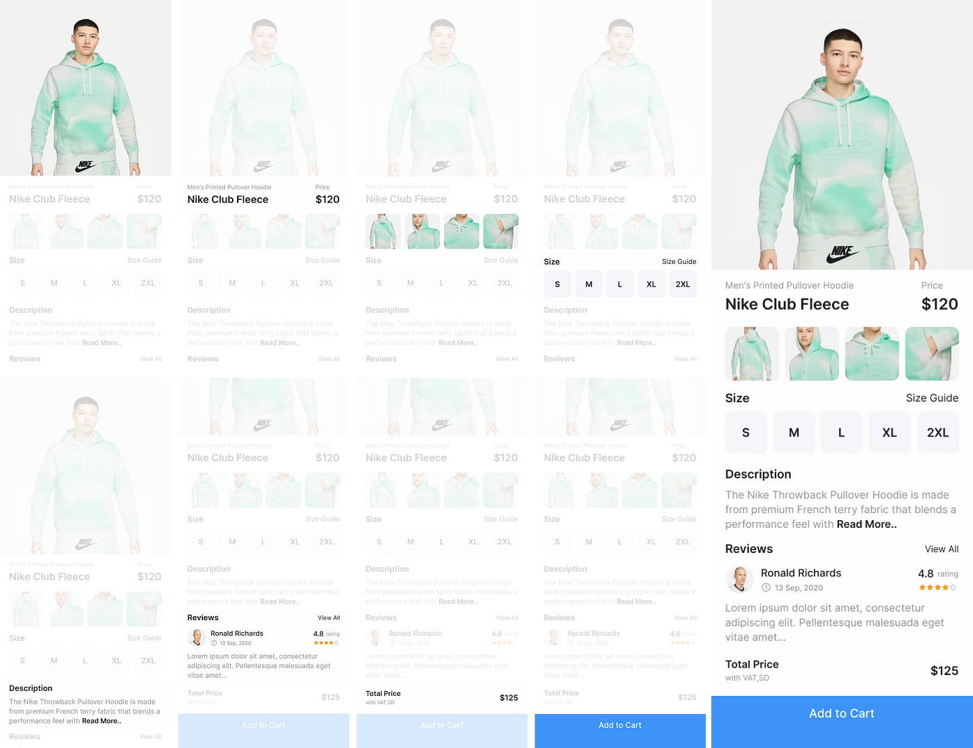
Many of us have experienced the frustration of losing something valuable in our rooms at least once. Especially as your room becomes more messy or larger, it takes even more time to find what you’re looking for. This is analogous to UI code. Code that is disorganized, with multiple widgets mixed on one page, becomes difficult to understand at a glance.
While the effort of searching for items in your room is something you can endure personally, disorganized UI code in a collaborative project can be a source of trouble for fellow developers. We shouldn’t have situations where colleagues are searching for lost items in your cluttered room.
In this article, we introduce methods to structure UI code, increasing readability and organizing it in a way that facilitates maintenance and collaboration. Feel free to glean some tips from this!
Problems with Spaghetti Code
Firstly, what are the issues with disorganized UI code?
class ProductDetailPage extends StatelessWidget {
const ProductDetailPage({Key? key}) : super(key: key);
@override
Widget build(BuildContext context) {
return Scaffold(
body: Stack(
children: [
SingleChildScrollView(
child: Column(
children: <Widget>[
// HEADER
Container(
height: 386,
decoration: BoxDecoration(
image: DecorationImage(
image: Image.asset(Assets.productImg0).image,
fit: BoxFit.cover),
),
),
const SizedBox(height: 15),
Padding(
padding: const EdgeInsets.symmetric(horizontal: 20),
child: Column(
crossAxisAlignment: CrossAxisAlignment.start,
children: <Widget>[
// PRODUCT INFO
SizedBox(
width: double.infinity,
child: Wrap(
crossAxisAlignment: WrapCrossAlignment.end,
alignment: WrapAlignment.spaceBetween,
children: <Widget>[
Wrap(
direction: Axis.vertical,
children: [
Text(
'Men\'s Printed Pullover Hoodie ',
style: AppTextStyle.body3.copyWith(
color: AppColor.grey,
),
),
const SizedBox(height: 8),
// NAME
Text(
'Nike Club Fleece',
style: AppTextStyle.headline3,
),
],
),
Wrap(
direction: Axis.vertical,
children: <Widget>[
Text(
'Price',
style: AppTextStyle.body3.copyWith(
color: AppColor.grey,
),
),
const SizedBox(height: 8),
Text(
'\$120',
style: AppTextStyle.headline3,
),
],
),
// CATEGORY
],
),
),
const SizedBox(height: 20),
// PRODUCT PICTURE LIST
Row(
mainAxisAlignment: MainAxisAlignment.spaceBetween,
children: <Widget>[
...List.generate(productImgList.length, (index) {
final img = productImgList[index];
final imgSize =
(MediaQuery.of(context).size.width - 67) / 4;
return Container(
height: imgSize,
width: imgSize,
decoration: BoxDecoration(
borderRadius: BorderRadius.circular(20),
image: DecorationImage(
image: Image.asset(img).image,
),
),
);
})
],
),
const SizedBox(height: 15),
// SIZE
Row(
mainAxisAlignment: MainAxisAlignment.spaceBetween,
children: <Text>[
Text(
'Size',
style: AppTextStyle.body1,
),
Text(
'Size Guide',
style: AppTextStyle.body2,
)
],
),
const SizedBox(height: 10),
Row(
mainAxisAlignment: MainAxisAlignment.spaceBetween,
children: <Widget>[
...List.generate(sizeOptions.length, (index) {
final option = sizeOptions[index];
final buttonSize =
(MediaQuery.of(context).size.width - 76) / 5;
return ElevatedButton(
style: ElevatedButton.styleFrom(
padding: EdgeInsets.zero,
minimumSize: Size(buttonSize, buttonSize),
elevation: 0,
shape: RoundedRectangleBorder(
borderRadius: BorderRadius.circular(10),
),
backgroundColor: AppColor.lightGrey,
foregroundColor:
AppColor.black,
),
onPressed: () {},
child: Text(option),
);
})
],
),
const SizedBox(height: 20),
// DESCRIPTION
Text(
'Description',
style: AppTextStyle.body1,
),
const SizedBox(height: 10),
const ExpandableTextView(
text: productDescription,
maxLines: 3,
),
// REVIEWS
Row(
mainAxisAlignment: MainAxisAlignment.spaceBetween,
children: [
Text(
'Reviews',
style: AppTextStyle.body1,
),
TextButton(
onPressed: () {},
child: Text(
'View All',
style: AppTextStyle.body3.copyWith(
color: AppColor.grey,
),
))
],
),
const SizedBox(height: 16),
ListView.builder(
padding: EdgeInsets.zero,
physics: const NeverScrollableScrollPhysics(),
shrinkWrap: true,
itemCount: 1,
itemBuilder: (context, index) {
return Column(
children: <Widget>[
Row(
children: <Widget>[
// PROFILE IMAGE
Container(
height: 40,
width: 40,
decoration: BoxDecoration(
shape: BoxShape.circle,
image: DecorationImage(
image: Image.asset(
'assets/images/avatar.png',
).image,
),
),
),
const SizedBox(width: 10),
Column(
crossAxisAlignment:
CrossAxisAlignment.start,
children: <Widget>[
// REVIEWER NAME
Text(
'Ronald Richards',
style: AppTextStyle.body2,
),
const SizedBox(height: 5),
Row(
mainAxisAlignment:
MainAxisAlignment.center,
children: <Widget>[
SvgPicture.asset(
Assets.clock,
),
const SizedBox(width: 5),
Text(
'13 Sep, 2020',
style: AppTextStyle.body4.copyWith(
color: AppColor.grey,
),
)
],
),
// REVIEWED DATE
],
),
const Spacer(),
Column(
children: <Widget>[
Text.rich(
TextSpan(
children: <TextSpan>[
TextSpan(
text: '4.8',
style: AppTextStyle.body2,
),
TextSpan(
text: ' rating',
style:
AppTextStyle.body4.copyWith(
color: AppColor.grey,
),
),
],
),
),
// my boss is fool
const SizedBox(height: 5),
SvgPicture.asset(
'assets/icons/group_star.svg')
],
),
],
),
const SizedBox(height: 10),
Text(
'Lorem ipsum dolor sit amet, consectetur...',
style: AppTextStyle.body2.copyWith(
color: AppColor.grey,
),
)
],
);
},
),
const SizedBox(height: 20),
// TOTAL Price
Row(
mainAxisAlignment: MainAxisAlignment.spaceBetween,
children: <Widget>[
Column(
crossAxisAlignment: CrossAxisAlignment.start,
children: <Widget>[
Text(
'Total Price',
style: AppTextStyle.body1,
),
const SizedBox(height: 5),
Text(
'with VAT, SD',
style: AppTextStyle.body4.copyWith(
color: AppColor.grey,
),
)
],
),
Text(
'\$125',
style: AppTextStyle.body1,
)
],
),
SizedBox(
height: MediaQuery.of(context).padding.bottom + 96,
)
],
),
),
],
),
),
// BOTTOM FIXED BUTTON
Positioned(
bottom: 0,
child: MaterialButton(
elevation: 0,
onPressed: () {},
padding: EdgeInsets.only(
bottom: MediaQuery.of(context).padding.bottom),
height: 56 + MediaQuery.of(context).padding.bottom,
minWidth: MediaQuery.of(context).size.width,
color: AppColor.purple,
child: Text(
'Add to Cart',
style: AppTextStyle.body1.copyWith(
color: AppColor.white,
),
),
),
)
],
),
);
}
}The problems are quite evident. Code like the example above, with lengthy declarative UI code, decreases readability. Moreover, reduced readability leads to more time spent analyzing the lengthy code when adding features or fixing errors. As the number of widgets on the screen increases, it becomes even more challenging to maintain. Even if you leave your frustrations about your boss in comments in this complex code, your boss probably won’t notice
On the contrary, clean UI code should be more simple and direct. It should be easy to understand the UI’s layout, and the code should allow for a quick understanding of the overall structure of the screen. You should be able to infer the general UI structure just by looking at the code, even without an immediate design reference.
1. Section Definition
Now, let’s walk through the step-by-step process of refactoring the long spaghetti code into a more organized UI code, using a simple example of a product detail page.

Firstly, it’s essential to clearly define each section of the page. Sections are typically distinguished based on layout or content of data. Below is the list of sections I’ve defined for this example:
- Header
- Leading Information
- Image List
- Size Information
- Description
- Review
- Price Information
- Bottom Fixed Button (Add to Cart button)
By defining each section, you make the structure clear when refactoring the code. It allows for a more independent handling of each section during the refactoring process.
2. Create Custom Scaffold Module
Now that you’ve identified the sections, it’s time to create a custom Scaffold module. This module will be a stateless class defining the layout structure of the product detail page. It takes the previously defined sections as widget properties and arranges them accordingly.
class ProductDetailScaffold extends StatelessWidget {
  const ProductDetailScaffold({
    Key? key,
    required this.header,
    required this.leadingInfoView,
    required this.imgListView,
    required this.sizeInfoView,
    required this.descriptionView,
    required this.reviewListView,
    required this.priceInfoView,
    required this.bottomFixedButton,
  }) : super(key: key);

  final Widget header;
  final Widget leadingInfoView;
  final Widget imgListView;
  final Widget sizeInfoView;
  final Widget descriptionView;
  final Widget reviewListView;
  final Widget priceInfoView;
  final Widget bottomFixedButton;

  @override
  Widget build(BuildContext context) {
    return Scaffold(
      backgroundColor: Colors.white,
      body: Stack(
        children: [
          SingleChildScrollView(
            child: Column(
              children: <Widget>[
                header,
                const SizedBox(height: 15),
                Padding(
                  padding: const EdgeInsets.symmetric(horizontal: 20),
                  child: Column(
                    crossAxisAlignment: CrossAxisAlignment.start,
                    children: <Widget>[
                      leadingInfoView,
                      const SizedBox(height: 20),
                      imgListView,
                      const SizedBox(height: 15),
                      sizeInfoView,
                      const SizedBox(height: 20),
                      descriptionView,
                      const SizedBox(height: 15),
                      reviewListView,
                      const SizedBox(height: 20),
                      priceInfoView,
                      SizedBox(
                        height: MediaQuery.of(context).padding.bottom + 96,
                      )
                    ],
                  ),
                ),
              ],
            ),
          ),

          /// BOTTOM FIXED BUTTON
          Positioned(
            bottom: 0,
            child: bottomFixedButton,
          )
        ],
      ),
    );
  }
}
Note that the Scaffold module should focus solely on the layout and the arrangement of widgets received as properties. In other words, it should not have widgets that carry state or depend on external data.
When creating the Scaffold module, a useful tip is that you don’t have to start by creating the Scaffold module itself. Implement the UI for the entire page first, and then create a separate Scaffold source file. Copy and modify the existing page code into the new Scaffold file.
3. Widget Modularization
Before applying the Scaffold, you need to extract each widget separated by section into individual Stateless Widgets.
/// Extracted as a Stateless Widget (O)
class ProductDetailHeader extends StatelessWidget {
  const ProductDetailHeader({Key? key}) : super(key: key);

  @override
  Widget build(BuildContext context) {
    return Container(
      height: 386,
      decoration: BoxDecoration(
        image: DecorationImage(
            image: Image.asset(Assets.imagesProductImg0).image,
            fit: BoxFit.fitHeight),
      ),
    );
  }
}

/// Extracted as a method (X)
_buildHeader() {
    return Container(
      height: 386,
      decoration: BoxDecoration(
        image: DecorationImage(
            image: Image.asset(Assets.imagesProductImg0).image,
            fit: BoxFit.fitHeight),
      ),
    );
}
When extracting a section, it’s important to extract it as a StatelessWidget rather than a method. This is because extracting it as a StatelessWidget allows you to separate the BuildContext, preventing the use of shared context in the widget tree. If the BuildContext is not separated, widgets that are unrelated to the state can be rebuilt together when a state change occurs in a different widget. Using StatelessWidget helps to minimize widget rebuilds.
Also, when naming the separated widgets, be cautious not to use names that may overlap with widgets from other pages. For example, an area like “Header” can be sufficiently defined as a section on other pages as well. To create unique names, you can prepend the page name to the widget name:
- ProductDetailHeader
- ProductDescriptionView
- ProductPriceInfoView
However, one drawback of this naming convention is that the class names can become too long. A better alternative is to use the private access modifier.
part of '../product_detail_screen.dart';

class _Header extends StatelessWidget {
  const _Header({Key? key}) : super(key: key);

  @override
  Widget build(BuildContext context) {
    return Container(
      height: 386,
      decoration: BoxDecoration(
        image: DecorationImage(
            image: Image.asset(Assets.imagesProductImg0).image,
            fit: BoxFit.fitHeight),
      ),
    );
  }
}
By using the access modifier, you can specify a class name, preventing other pages from importing that header module, making widget modularization more reliable.

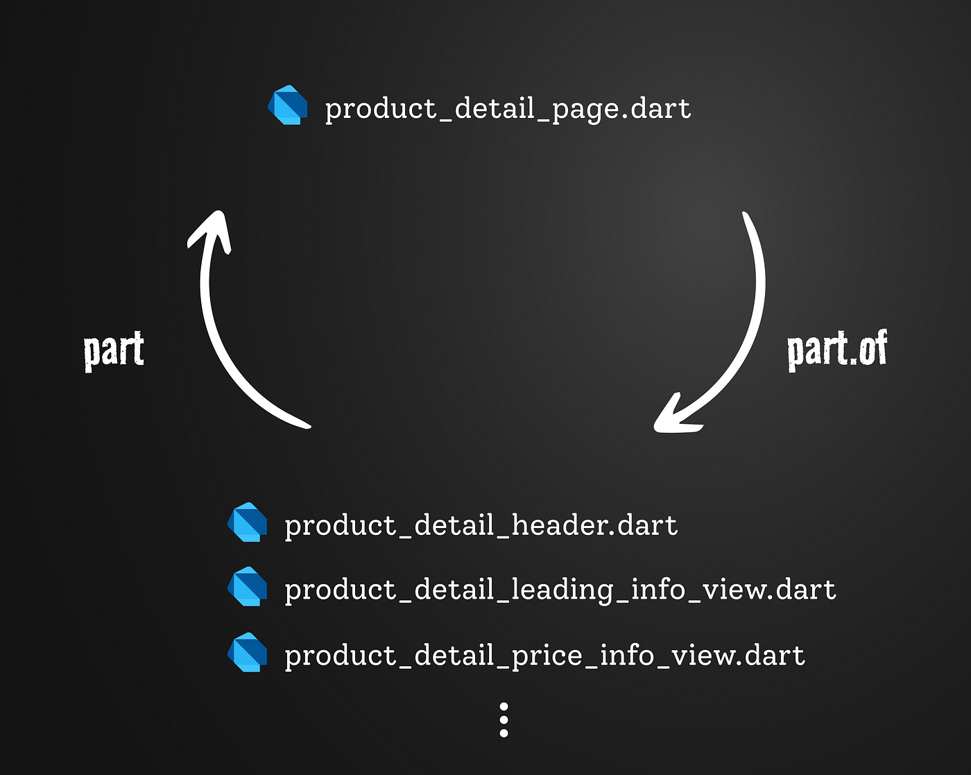
If you want to manage the widgets in a separate source file, use the part and part of directives to connect the page widget and the separated section widgets.
4. Applying the Scaffold Module
Now that all the preparations are done, you can apply the previously created Scaffold module and the separated widgets to the existing page.
part 'local_widgets/bottom_fixed_button.dart';
part 'local_widgets/description_view.dart';
part 'local_widgets/img_list_view.dart';
part 'local_widgets/leading_info_view.dart';
part 'local_widgets/price_info_view.dart';
part 'local_widgets/product_detail_header.dart';
part 'local_widgets/product_detail_layout.dart';
part 'local_widgets/review_list_view.dart';
part 'local_widgets/size_info_view.dart';

class ProductDetailPage extends StatelessWidget {
  const ProductDetailPage({Key? key}) : super(key: key);

  @override
  Widget build(BuildContext context) {
    return const _Scaffold(
      header: _Header(),
      leadingInfoView: _LeadingInfoView(),
      imgListView: _ImgListView(),
      sizeInfoView: _SizeInfoView(),
      descriptionView: _DescriptionView(),
      reviewListView: _ReviewListView(),
      priceInfoView: _PriceInfoView(),
      bottomFixedButton: _BottomFixedButton(),
    );
  }
}
The code looks much cleaner than before.
Benefits of Clean UI Code
The refactored UI code has two significant advantages.
Ease of Maintenance
Firstly, it becomes a code that can easily adapt to changes. For example, let’s assume a request comes in to ‘change the font size of the product description text.’ In the case of spaghetti code with a long list, it might take some time to find the widget that contains the product description text. If someone who didn’t write the code has to find that widget, it will undoubtedly take even longer. However, by structuring the UI as introduced earlier and refactoring, you can easily locate the widget that needs modification.
Collaboration-Friendly
Such structured code shines when collaborating with multiple developers. Let’s imagine two developers working together to implement the UI for a page. Without structuring the code and working in a single source file, conflicts may arise during the code merging process later.
@override
Widget build(BuildContext context) {
  return const _Scaffold(
    appBar: _AppBar(),
    contentTabView: _ContentTabView(), // <-- Team member 1's workspace
    reviewTabView: _ReviewTabView(), // <-- Team member 2's workspace
  );
}
However, by structuring the UI code as shown above, separating workspaces in advance, unnecessary conflicts can be prevented during the code merging process.
Colnclusion
In this post, we explored how to structure UI code to enhance readability and create a more maintainable and collaborative development environment. While the methods introduced may seem a bit meticulous, especially for larger apps with numerous pages, they offer significant advantages. If you’re dealing with a substantial codebase, considering these practices can be highly beneficial.


