React is arguably the most popular JavaScript library for building user interfaces and one reason for this is its unopinionated nature. The reusable components, great developer tools, and extensive ecosystem are some of the most loved features of React. However, in addition to its features and community support, React delivers and implements some widely used design patterns to ease the development process even further.
Before delving into the details of React’s design patterns, we should understand what they are and why they are needed. Simply put, design patterns are repeatable solutions to commonly occurring development problems. They serve as a basic template upon which you can build up any functionality according to the given requirements while following the best practices. We can use them to save development time and reduce coding efforts since they serve as standard terminology and pre-tested solutions to known problems.
Let’s get started!
Conditional Rendering
This is undoubtedly one of the most basic and widely used patterns with React components (that perhaps doesn’t need much introduction either 😅). Quite frequently the need arises to render or not render a certain JSX code based on a certain condition. This is achieved through conditional rendering. As an example, we’d want to show a button that says “Log In” for unauthenticated users and Log Out for signed-in users.

Typically conditional rendering is achieved using either the && operator or the ternary operator.
{condition && <span>Rendered when `truthy`</span>}
{condition ? <span>Rendered when `truthy`</span> : <span>Rendered when `falsy`</span>}
In some cases, we might also consider using if, switch, or object literals.
Custom Hooks
React hooks have proven to be a revolutionary introduction in conjunction with functional components. They provide a simple and direct way to access common React features such as props, state, context, refs, and lifecycle. We may be content using the traditional hooks but there’s more. Let’s understand the benefit of having custom hooks introduced in the mix. Think of a piece of logic that you wrote for a component, you possibly used basic hooks like useEffect & useState. After some time, the same logic needs to be used in another new component. While copying may feel like the quickest & easiest way to do that, custom hooks to the same effect are way more fun (😉). Extracting commonly needed logic in a hook makes for clean code & increases reusability & of course maintainability.

Starting off with a common use case, calling APIs in different components. Think of a component that renders a list of users after fetching the data from an API.
const UsersList = () => {
  const [data, setData] = useState(null);
  const [error, setError] = useState("");
  const [loading, setLoading] = useState(true);

  const fetchData = async () => {
    try {
      const res = await fetch("https://jsonplaceholder.typicode.com/users");
      const response = await res.json();
      setData(response.data);
    } catch (error) {
      setError(error);
      setLoading(false);
    } finally {
      setLoading(false);
    }
  };

  useEffect(() => {
    fetchData();
  }, []);

  return (...);
};
Since the API calls are pretty much the backbone for most components, why not extract it in 1 place? This functionality can be easily pulled in a new useFetch hook as:
export const useFetch = (url, options) => {
  const [data, setData] = useState();
  const [error, setError] = useState("");
  const [loading, setLoading] = useState(true);

  const fetchData = async () => {
    try {
      const res = await fetch(url, options);
      const response = await res.json();
      setData(response.data);
    } catch (error) {
      setError(error);
      setLoading(false);
    } finally {
      setLoading(false);
    }
  };

  useEffect(() => {
    fetchData();
  }, []);

  return { data, error, loading, refetch: fetchData };
};

const UsersList = () => {
  const { data, error, loading, refetch } = useFetch(
    "https://jsonplaceholder.typicode.com/users"
  );

  return (...);
};
Some other possible use cases that come to mind for custom hooks could be:
● Getting window dimensions
● Accessing & setting local storage
● Toggling between boolean states, etc.
Provider Pattern
One major problem faced by React developers is Prop drilling. Prop drilling is a scenario in which data (props) is passed down to different components until it gets to the component where the prop is needed. This easily becomes a problem when some data needs to be passed to one or more nested components deep down in the component tree since a seemingly unnecessary chain of data passing is established.
This is where the Provider pattern comes to the aid. Provider pattern allows us to store data (global or shareable in nature) in a central location. The Context Provider/Store can then pass this data to any component that needs it directly without drilling props. React’s built-in Context API is based on this approach. Some other libraries that use this pattern include react-redux, flux, MobX, etc.
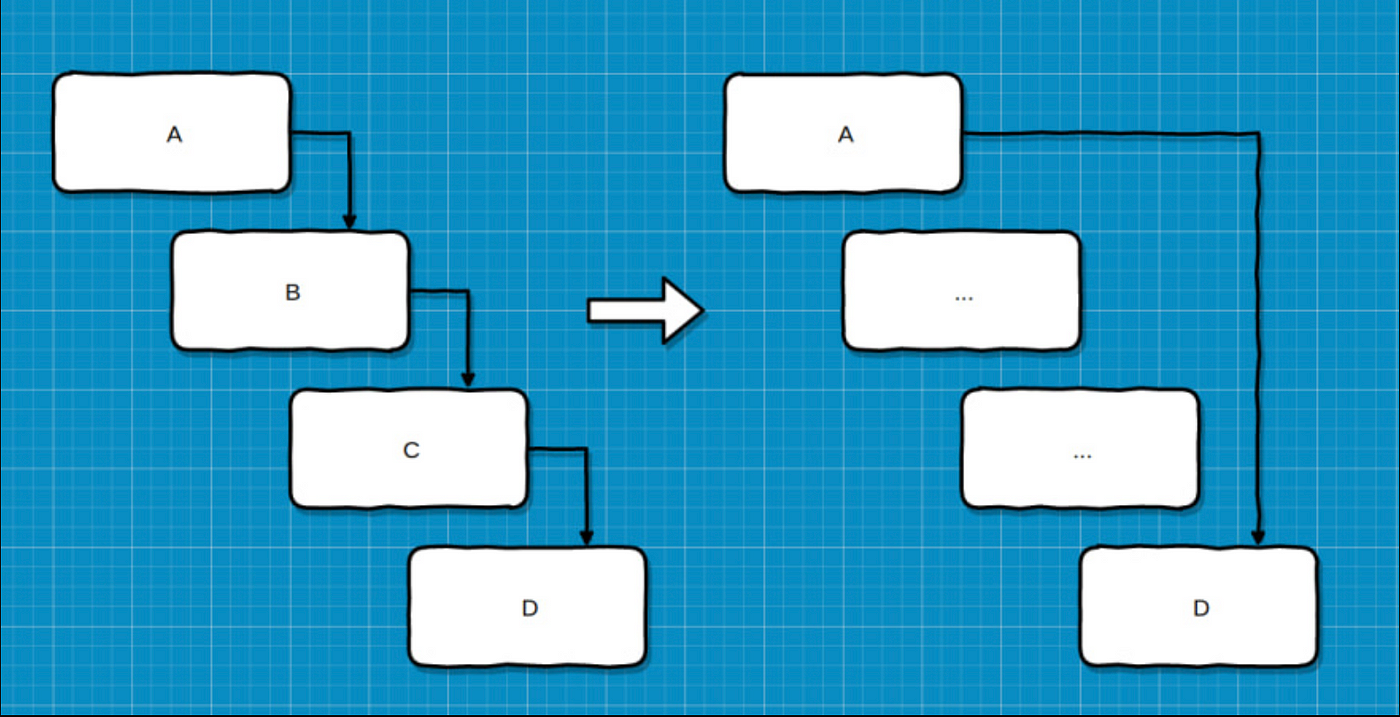
To understand this with an example, one common scenario is implementing a light/dark theme in your application. If it weren’t for the Provider pattern, our implementation would look like this:
const App = ({ theme }) => {
  return (
    <>
      <Header theme={theme} />
      <Main theme={theme} />
      <Footer theme={theme} />
    </>
  );
};

const Header = ({ theme }) => {
  return (
    <>
      <NavMenu theme={theme} />
      <PreferencesPanel theme={theme} />
    </>
  );
};
Let’s see how introducing Context API simplifies things.
const ThemeContext = createContext("light", () => "light");

const ThemeProvider = ({ children }) => {
  const [theme, setTheme] = useState("light");
  return (
    <ThemeContext.Provider value={{ theme, setTheme }}>
      {children}
    </ThemeContext.Provider>
  );
};
export { ThemeContext, ThemeProvider };

const App = () => {
  return (
    <ThemeProvider>
      <Header />
      <Main />
      <Footer />
    </ThemeProvider>
  );
};
const PreferencesPanel = () => {
  const { theme, setTheme } = useContext(ThemeContext);

  ...
};
Isn’t this better! Other possible usages for Provider pattern could be:
● Authentication state management
● Managing locale/language selection preferences, etc.
Higher Order Components Pattern
HOCs in React is an advanced technique for reusing logic in components. It is a pattern created out of React’s compositional nature. It essentially incorporates the don’t-repeat-yourself (DRY) principle of programming. Similar to higher-order functions in JS, HOCs are pure functions that take a component as an argument and return an enhanced & upgraded component. It is in line with the nature of React functional components, that is composition over inheritance. Some real-world examples include:
● react-redux: connect(mapStateToProps, mapDispatchToProps)(UserPage)
● react-router: withRouter(UserPage)
● material-ui: withStyles(styles)(UserPage)
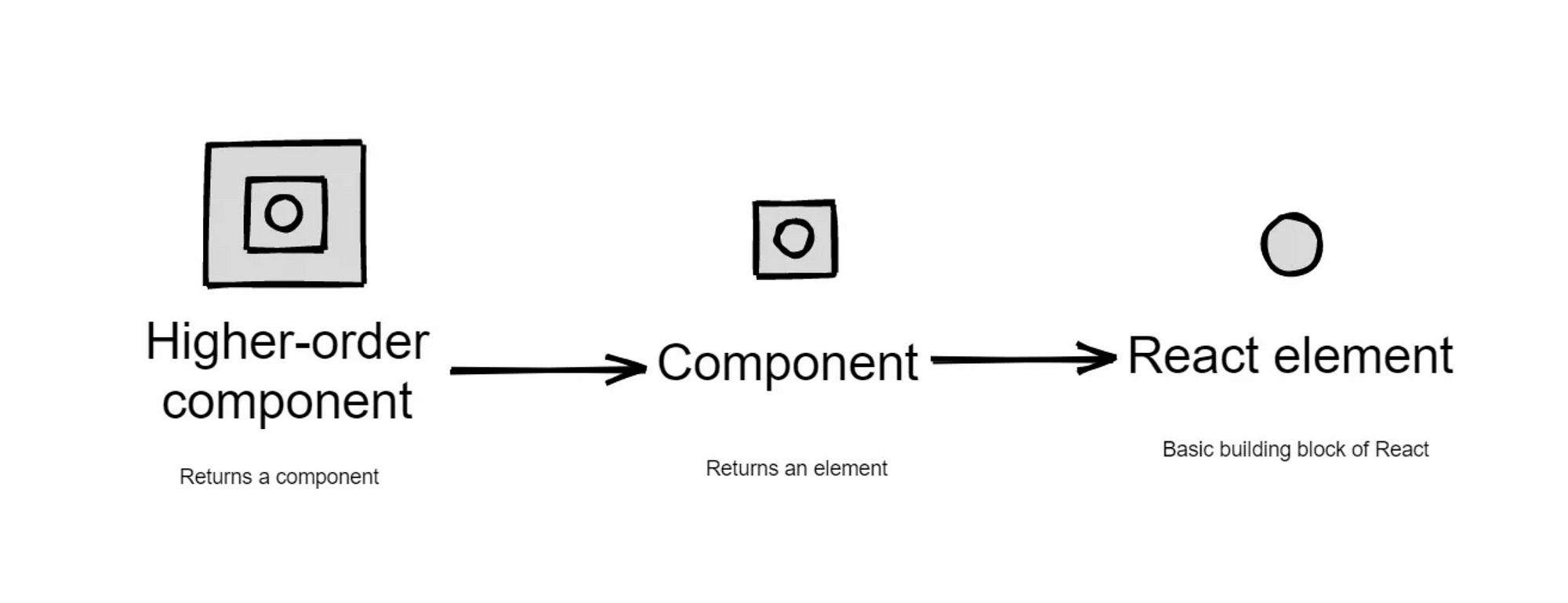
As an example, consider a simple component that renders a list of users & handle various state like loading, error, and no available data.
const UsersList = ({ hasError, isLoading, data }) => {
  const { users } = data;
  if (isLoading) return <p>Loading…</p>;
  if (hasError) return <p>Sorry, data could not be fetched.</p>;
  if (!data) return <p>No data found.</p>;

  return (
    <ul>
      {users.map((user) => (
        <li key={user.id}>{user.name}</li>
      ))}
    </ul>
  );
};

const { data, loading, error } = fetchData();
<UsersList {...{ data, error }} isLoading={loading} />;
Showing such different API fetch states is a common logic that can be easily re-used in many components. Hence to pull it out in an HOC, we can do something like:
const withAPIFeedback =
  (Component) =>
  ({ hasError, isLoading, data }) => {
    if (isLoading) return <p>Loading…</p>;
    if (hasError) return <p>Sorry, data could not be fetched.</p>;
    if (!data) return <p>No data found.</p>;
    return <Component {...{ data }} />;
  };

const UsersList = ({ data }) => {
  const { users } = data;
  return (
    <ul>
      {users.map((user) => (
        <li key={user.id}>{user.name}</li>
      ))}
    </ul>
  );
};

const { data, loading, error } = fetchData();
const UsersListWithFeedback = withAPIFeedback(UsersList);
<UsersListWithFeedback {...{ data, error }} isLoading={loading} />;
HOCs are useful when dealing with cross-cutting concerns, specifically where we want to reuse component logic across the application. Some possible usages could be:
● Implementing logging mechanisms.
● Managing authorizations, etc.
Presentational & Container Components Pattern
As the name suggests, this approach involves dividing the components into 2 different categories & implementation strategies:
- Presentation Components: These are essentially pure stateless functional components. These are concerned with how things look. They don’t have any dependencies with any part of the application and are used to display data.
- Container Components: Unlike presentational components, Container components are more responsible for how things work. They act as a container for any side effects, stateful logic, and the presentational components themselves.
With this approach, we achieve better separation of concern (since we don’t have just 1 complex component that handles all the rendering and logical states). In addition, this provides better reusability with Presentation components (since they don’t have any dependencies, they can be easily reused for multiple scenarios).
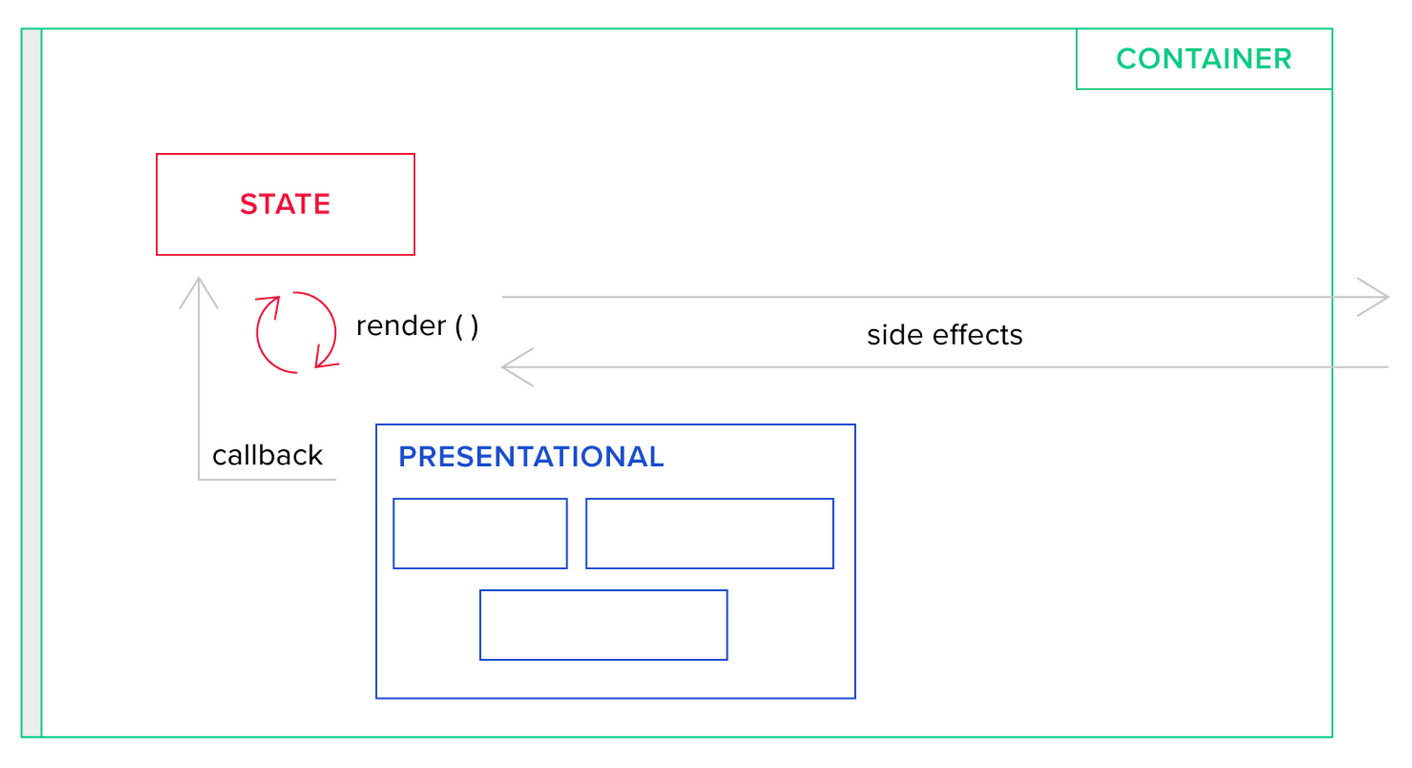
Therefore, your aim, as a developer, should be to create stateless components even if there is no immediate scenario in which you would have to reuse that particular component. For a hierarchy of components, the best practice is to let parent components keep as much state as possible and make stateless child components.
As an example, any component that renders a list could be a presentational component:
const ProductsList = ({ products }) => {
  return (
    <ul>
      {products.map((product) => (
        <li key={product.id}>{product.name}</li>
      ))}
    </ul>
  );
};
The corresponding container component for this could be:
const ProductsCatalog = () => {
  const [products, setProducts] = useState([]);

  useEffect(() => {
    fetchProducts();
  }, []);

  return <ProductsList {...{ products }} />;
};
Controlled & Uncontrolled Component Pattern
Web forms are a common requirement in a large number of applications. In React, there are two ways to handle form data in our components. The first way is by using React state within the component to handle the form data. This is called a controlled component. The second way is to let the DOM handle the form data by itself in the component. This is known as an uncontrolled component. “Uncontrolled” refers to the fact that these components are not controlled by React state but rather by traditional DOM mutations.
To understand these better, let’s start with the example of an uncontrolled component.
function App() {
  const nameRef = useRef();
  const emailRef = useRef();

  const onSubmit = () => {
    console.log("Name: " + nameRef.current.value);
    console.log("Email: " + emailRef.current.value);
  };

  return (
    <form onSubmit={onSubmit}>
      <input type="text" name="name" ref={nameRef} required />
      <input type="email" name="email" ref={emailRef} required />
      <input type="submit" value="Submit" />
    </form>
  );
}
Here, we use a ref to access the input. This approach works so that you have to pull the value from the field when you need it. Let’s now see what would the controlled version of this form look like:
function App() {
  const [name, setName] = useState("");
  const [email, setEmail] = useState("");

  const onSubmit = () => {
    console.log("Name: " + name);
    console.log("Email: " + email);
  };

  return (
    <form onSubmit={onSubmit}>
      <input
        type="text"
        name="name"
        value={name}
        onChange={(e) => setName(e.target.value)}
        required
      />
      <input
        type="email"
        name="email"
        value={email}
        onChange={(e) => setEmail(e.target.value)}
        required
      />
      <input type="submit" value="Submit" />
    </form>
  );
}
Here, the input’s value is always driven by the React state. This flow kind of pushes the value changes to the form component, so the Form component always has the current value of the input, without needing to ask for it explicitly. While this means you have to type a bit more code, you can now pass the value to other UI elements too, or reset it from other event handlers perhaps using props and event callbacks.
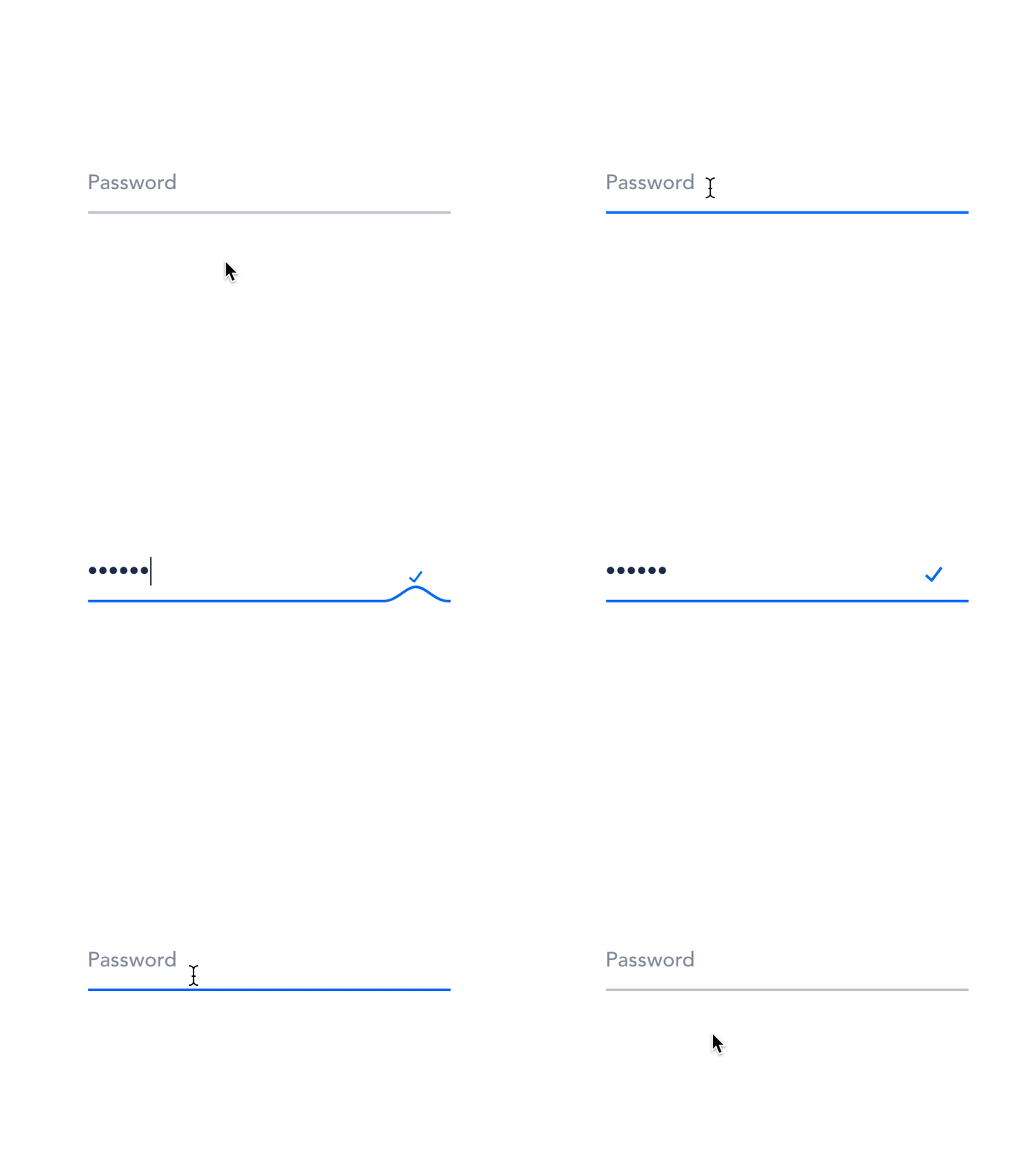
React forms have support for both controlled and uncontrolled components. We may have certain use cases where we are working with simple UI & feedback, then we might find it preferable to adopt uncontrolled components. For complex logic, it is highly recommended that we use controlled components.
Render Props Pattern
As per React’s official documentation, Render Prop refers to a technique of sharing code between components using a prop whose value is function. Similar to HOCs, Render Props also serves the same purpose: dealing with cross-cutting concerns by sharing stateful logic between components.
A component implementing the Render prop design pattern takes a function returning React Element as a prop and calls it instead of using its render logic. So, instead of hardcoding the logic inside each component, we can use the function prop to determine what to render.
To understand this better, let’s take an example. Suppose we have a list of products that need to be rendered in different locations in the application. The UI experience differs for these locations, however, the logic is the same — fetch the products from the API & render the list.
const ProductsSection = () => {
  const [products, setProducts] = useState([]);

  const fetchProducts = async () => {
    try {
      const res = await fetch("https://dummyjson.com/products");
      const response = await res.json();
      setProducts(response.products);
    } catch (e) {
      console.error(e);
    }
  };

  useEffect(() => {
    fetchProducts();
  }, []);

  return (
    <ul>
      {products.map((product) => (
        <li key={product.id}>
          <img src={product.thubmnail} alt={product.name} />
          <span>{product.name}</span>
        </li>
      ))}
    </ul>
  );
};

const ProductsCatalog = () => {
  const [products, setProducts] = useState([]);

  const fetchProducts = async () => {
    try {
      const res = await fetch("https://dummyjson.com/products");
      const response = await res.json();
      setProducts(response.products);
    } catch (e) {
      console.error(e);
    }
  };

  useEffect(() => {
    fetchProducts();
  }, []);

  return (
    <ul>
      {products.map((product) => (
        <li key={product.id}>
          <span>Brand: {product.brand}</span>
          <span>Trade Name: {product.name}</span>
          <span>Price: {product.price}</span>
        </li>
      ))}
    </ul>
  );
};
We could easily reuse this functionality with the Render Props pattern:
const ProductsList = ({ renderListItem }) => {
  const [products, setProducts] = useState([]);

  const fetchProducts = async () => {
    try {
      const res = await fetch("https://dummyjson.com/products");
      const response = await res.json();
      setProducts(response.products);
    } catch (e) {
      console.error(e);
    }
  };

  useEffect(() => {
    fetchProducts();
  }, []);

  return <ul>{products.map((product) => renderListItem(product))}</ul>;
};

// Products Section
<ProductsList
  renderListItem={(product) => (
    <li key={product.id}>
      <img src={product.thumbnail} alt={product.title} />
      <div>{product.title}</div>
    </li>
  )}
/>

// Products Catalog
<ProductsList
  renderListItem={(product) => (
    <li key={product.id}>
      <div>Brand: {product.brand}</div>
      <div>Name: {product.title}</div>
      <div>Price: $ {product.price}</div>
    </li>
  )}
/>
Some popular libraries that use the Render Props pattern include: React Router, Formik, Downshift.
Compound Components Pattern
Compound components are an advanced React container pattern that provides a simple and efficient way for multiple components to share states and handle logic — working together. It provided a flexible API that enables a parent component to interact and share state with its children implicitly. Compound components are best suitable for React apps where you need to build declarative UI. This pattern is also used in some popular design libraries like Ant-Design, Material UI etc.
The way the traditional select and options HTML elements work helps us understand this better. Both select and options work in sync to provide a dropdown form field. The select element manages and shares its state implicitly with the options elements. Consequently, although there is no explicit state declaration, the select element knows what option the user selects. Similarly here, we may use the Context API to share & manage the state between the parent and child components as needed.
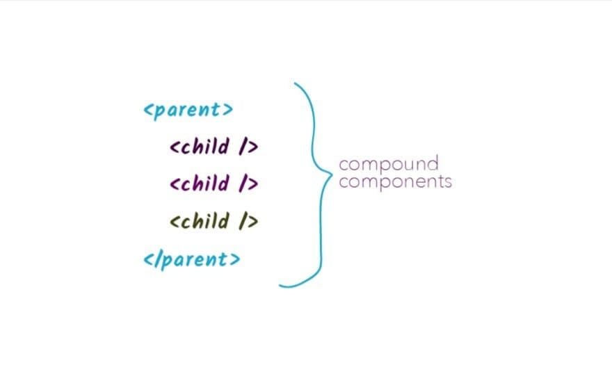
Diving into the code, let’s try to implement a Tab component as a compound component. Typically tabs have a list of tabs and a content section is associated with each of them. At a time, only 1 tab is active and its contents are visible. This is how we can do it:
const TabsContext = createContext({});

function useTabsContext() {
  const context = useContext(TabsContext);
  if (!context) throw new Error(`Tabs components cannot be rendered outside the TabsProvider`);
  return context;
}

const TabList = ({ children }) => {
  const { onChange } = useTabsContext();

  const tabList = React.Children.map(children, (child, index) => {
    if (!React.isValidElement(child)) return null;
    return React.cloneElement(child, {
      onClick: () => onChange(index),
    });
  });

  return <div className="tab-list-container">{tabList}</div>;
};

const Tab = ({ children, onClick }) => (
  <div className="tab" onClick={onClick}>
    {children}
  </div>
);

const TabPanels = ({ children }) => {
  const { activeTab } = useTabsContext();

  const tabPanels = React.Children.map(children, (child, index) => {
    if (!React.isValidElement(child)) return null;
    return activeTab === index ? child : null;
  });

  return <div className="tab-panels">{tabPanels}</div>;
};

const Panel = ({ children }) => (
  <div className="tab-panel-container">{children}</div>
);

const Tabs = ({ children }) => {
  const [activeTab, setActiveTab] = useState(0);

  const onChange = useCallback((tabIndex) => setActiveTab(tabIndex), []);
  const value = useMemo(() => ({ activeTab, onChange }), [activeTab, onChange]);

  return (
    <TabsContext.Provider value={value}>
      <div className="tabs">{children}</div>
    </TabsContext.Provider>
  );
};

Tabs.TabList = TabList;
Tabs.Tab = Tab;
Tabs.TabPanels = TabPanels;
Tabs.Panel = Panel;
export default Tabs;
This can now be used as:
const App = () => {
  const data = [
    { title: "Tab 1", content: "Content for Tab 1" },
    { title: "Tab 1", content: "Content for Tab 1" },
  ];

  return (
    <Tabs>
      <Tabs.TabList>
        {data.map((item) => (
          <Tabs.Tab key={item.title}>{item.title}</Tabs.Tab>
        ))}
      </Tabs.TabList>
      <Tabs.TabPanels>
        {data.map((item) => (
          <Tabs.Panel key={item.title}>
            <p>{item.content}</p>
          </Tabs.Panel>
        ))}
      </Tabs.TabPanels>
    </Tabs>
  );
};
Some other use cases where we can use this pattern include:
● Lists and list items
● Menu and menu headers, menu items, dividers.
● Table and table head, table body, table row, table cell
● Accordion with title and contents
● Switch and toggle
Layout Components Pattern
When creating a react application/website, most of the pages would be sharing the same content all over. For example the navigation bar and page footer. Instead of importing each component on every page to be rendered, it is much easier and faster to just create a layout component. Layout components help us share common sections easily across multiple pages. Just as its name suggests — it defines the layout of the application.
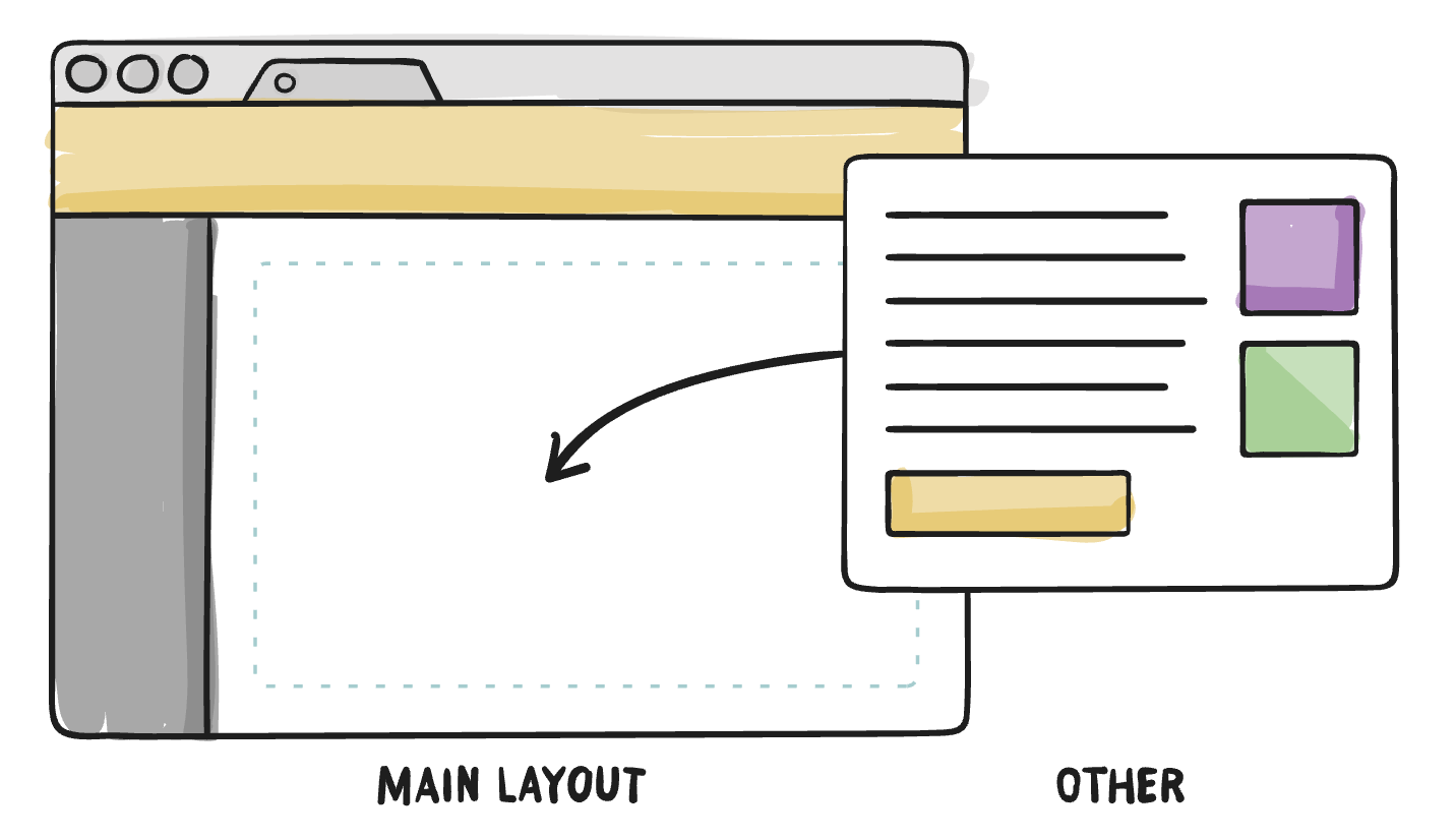
Working with reusable layouts is a very good practice because it lets us write code once and use it in a lot of parts of your application, eg. — we can easily reuse layouts based on the Grid system or Flex Box model.
For now, let’s consider a basic example of a Layout component through which we can share the Header and Footer across multiple pages.
const PageLayout = ({ children }) => {
  return (
    <>
      <Header />
      <main>{children}</main>
      <Footer />
    </>
  );
};

const HomePage = () => {
  return <PageLayout>{/* Page content goes here */}</PageLayout>;
};


